UX/UI Design Recro

What Did We Do
UX analytics
At the UX analytics stage, after analyzing the Recro website, it was revealed that the main goal of the project is to increase the conversion rate in site visits and improve the user experience for representatives of the B2G segment.
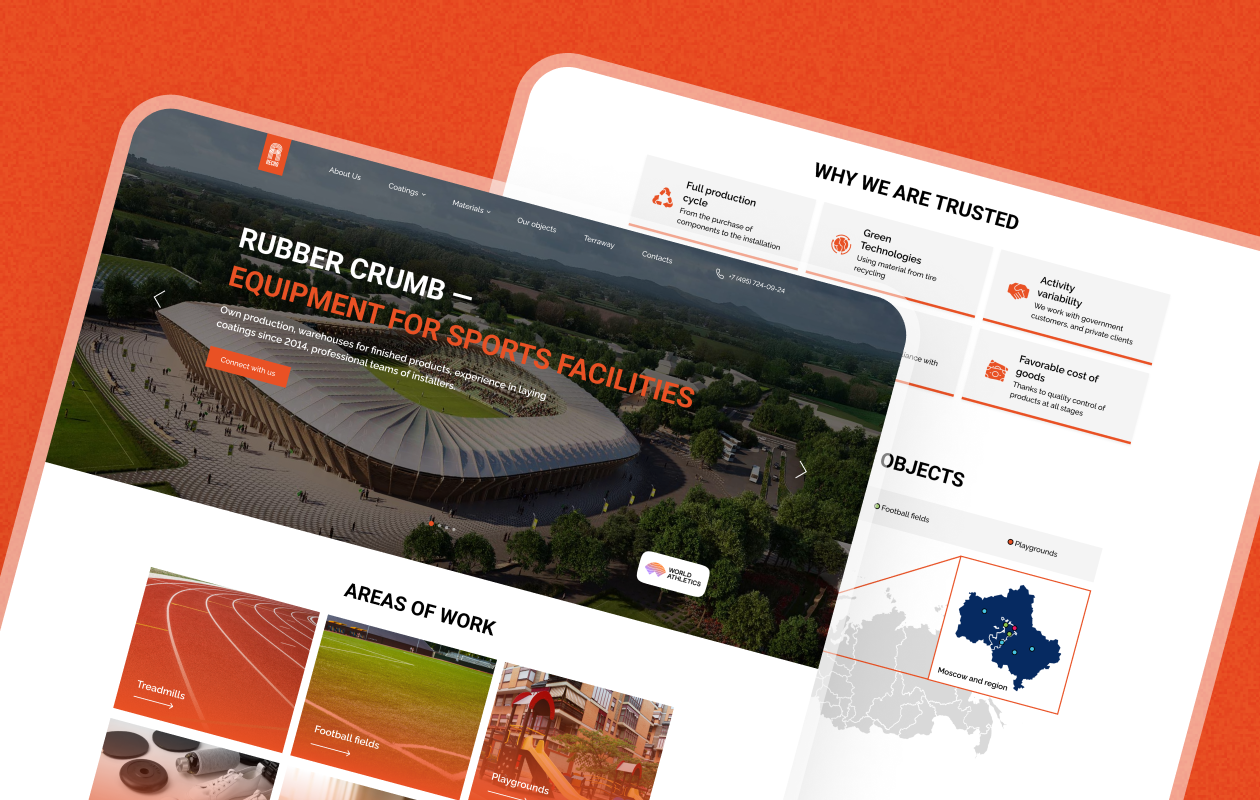
To achieve this goal, the analytics paid particular attention to blocks with numbers, which were supposed to clearly convey to customers the importance of Recro’s work in this area. The idea of including location maps and lists of partners was also put forward, which contributed to additional content, improved navigation and user experience.
At the analytics stage, the websites of large crumb rubber manufacturing plants, such as Bronitex, Votkinsk Plant and Constellation, were collected and analyzed to learn about the latest trends and standards in the production and sale of crumb rubber. This data was used to identify best practices and recommendations for improving the UX design of Recro’s website to deliver the best user experience and conversions for B2G clients.

UI design
During the UI design phase of the Recro website redesign project, special attention was paid to the attractiveness and scale of the information presented. At this stage, design concepts were developed, which were presented to the client for choice.
In order to demonstrate the scale of Recro’s activities, it was decided to pay special attention to the photos on the site. Bright and high-quality photos were chosen, displaying a wide range of products and services of the company, which created a convenient and attractive user interface.
It was also decided to visually display the location of the company’s facilities on the map to help site visitors quickly and easily find the information they are interested in and show the scale of Recro’s activities.
The UI design phase also developed graphic elements such as color schemes, themed illustrations, and distinctive font style to grab and hold the attention of site visitors.
As a result, at the UI design stage, Recro’s website design has become more modern and attractive, attracting and holding the attention of users and providing a user-friendly interface and ease of use.

