UX/UI Design PlanProject

What Did We Do
UX analytics
At the stage of UX-analytics, an analysis of the current query system of the Plan Project company was carried out. As a result of the analysis, it was revealed that the number of working statuses is 10, which creates unnecessary steps in the process of compiling a request. To simplify and optimize the process, it was decided to reduce the number of work statuses to 6.
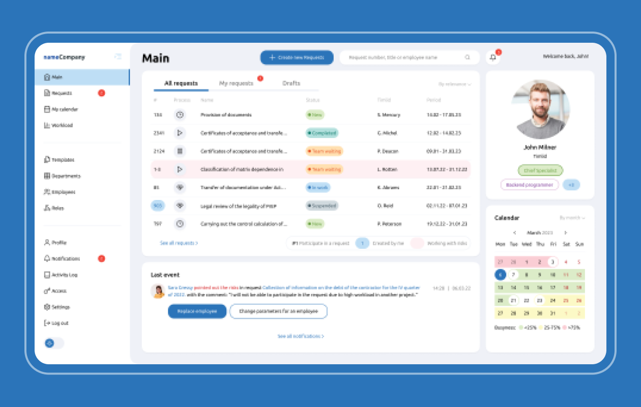
Further, the request was divided into 3 stages to speed up the process of its preparation. To improve the user experience, a Home page has been added to the system, where the user can get a summary of the status of their requests and quickly jump to the required section.
To make it easier to work with the system, the Calendar, Templates and Notifications sections were developed from scratch. As a result, user navigation has improved and query time has been reduced.
A dark theme was also added, which not only improved the visual experience of users, but also allowed employees to work in a more comfortable mode.
At the last stage of work, mobile and tablet adaptive versions of the service were designed, which will allow users to conveniently work with the system on various devices.
The result of work at the UX analytics stage was the creation of a more convenient, efficient and easy-to-use query system for Plan Project employees.

UI design
When creating the design, we used light pastel colors that create a light and pleasant working atmosphere.
Dividers have been used to improve readability and organize information on the pages. They allow you to logically separate interface elements and make understanding information easier and more intuitive.
We also selected 26 icons that complement the overall visual concept of the service and simplify user navigation. Icons are used to indicate various functions and actions in the interface, which allows you to quickly navigate the system.
To create the project, a flat design concept was applied, which helped to create a clear and user-friendly interface. Special attention was paid to working with typography to make the texts as readable and user-friendly as possible.
As a result, at the UI design stage, a clean, understandable and easy-to-use product was created that users will be happy to use. Our design concept was focused on user friendliness and ease of use, which will allow users to perform their tasks efficiently and increase their efficiency in the workflow.

