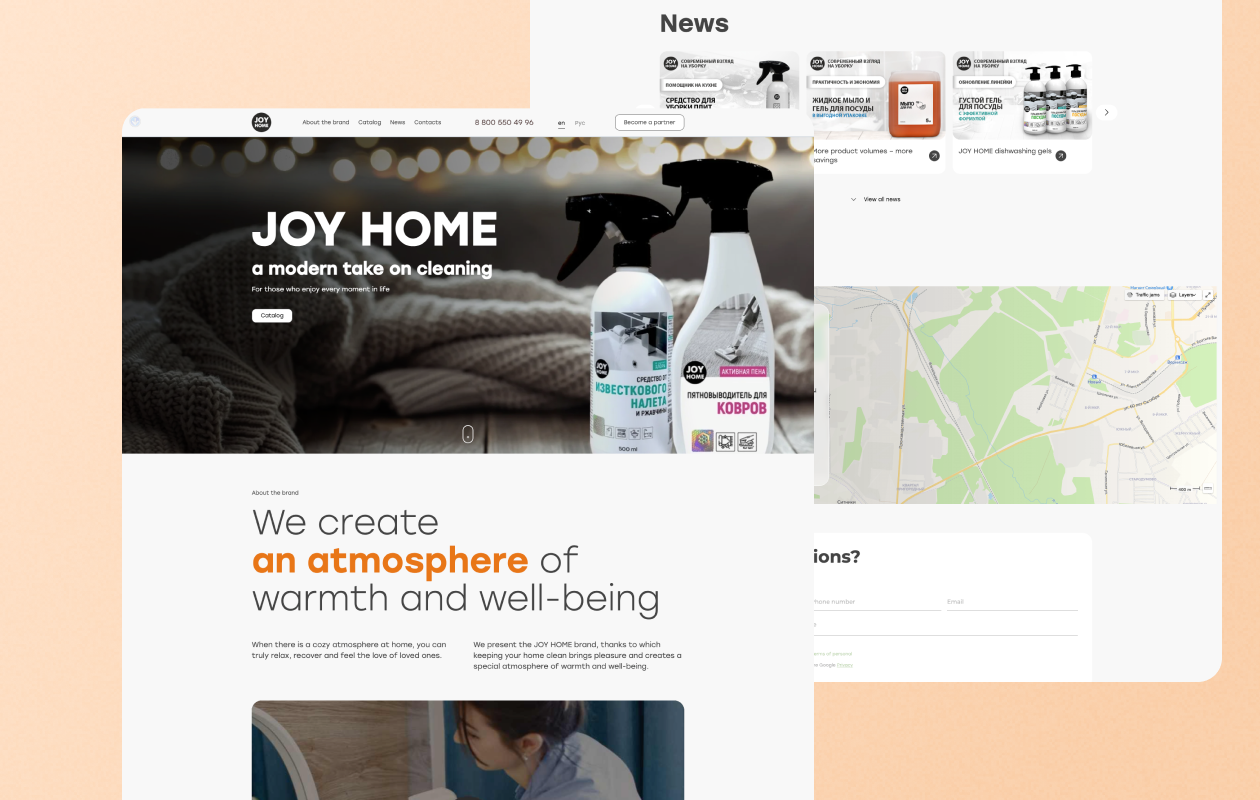
Landing Page Joy Home

What was done
Analytics
The analysis began with a deep understanding of the JOY HOME brand, its values and goals. This included studying product design, unique formulations and sustainability principles. It was revealed that the brand focuses on modern minimalism and effective recipes. These aspects were included in the landing page design and content strategy.rnrnStudying the online presence of competitors allowed us to identify successful practices that could be adapted for JOY HOME. The elements of interactivity used by competitors to attract the attention of visitors were identified. An important step was to carefully study the customer’s requirements. Particular attention was paid to minimalism, easy navigation, and the concept of “caring for the planet” in creating the landing page. These requirements became the basis for the design and development of the site.
Site development
Taking into account the analysis of the brand and customer requirements, a unique design was developed. The monochrome color palette with the addition of accent bright light colors in the text and product covers emphasized modernity and associations with warmth and safety. The design reflects the brand’s style using minimalist elements. The logical structure of the one-page site is created to highlight the key aspects of the brand. A special section News has been allocated to attract the attention of visitors. The navigation is designed to smoothly lead the user from one block to another, maintaining interest and ease of perception of information. Interactive elements have been added, such as video content and a user-friendly product card interface. They create an engaging experience for visitors and stimulate interaction. rnIntegrated feedback forms, newsletter subscriptions, language switching to attract an international audience. Landing has become not only an informative, but also a functional tool for customers, allowing them to easily contact the brand and place orders.


