Business Site Bytplast

What was done
Analytics
In the analysis phase, our team conducted comprehensive research to understand the company’s current needs and determine the optimal solutions.
We studied the behavior of potential users to understand their needs and expectations. Competitor research helped identify best practices in product presentation and user experience. Competitor analysis showed that clear and intuitive catalog navigation significantly improves the user experience. We took this into account when developing the structure of the new site.
We gathered all necessary information about the company’s products, including descriptions, photos, and texts. This content was revised and adapted for the new design. Product photos were updated and optimized for the web to improve visual perception and page load speed. Collecting and analyzing existing content helped us understand how best to structure the information on the new site.
We conducted UX research to identify the main needs and preferences of users. This included analyzing user behavior, creating user scenarios, and conducting interviews with potential customers. Testing showed that users value simplicity and quick access to the information they need. Therefore, we prioritized developing convenient and intuitive navigation and filter systems for the catalog.
Site development
In the development phase, our team took the following key steps to create the new site:
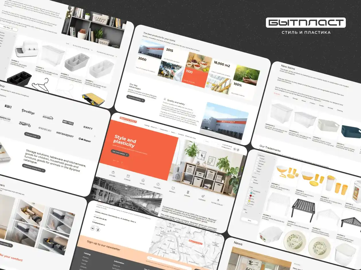
1. Unique Design Development. We created a new, modern website design that reflects the “Bytplast” brand and products. The design was developed in the Figma editor and took into account all aspects of the company’s corporate identity. The color palette, including orange and light gray colors, and visual elements were chosen to match the company’s corporate style while creating a fresh and attractive look for the site. The design included the use of large product images, minimalist icons, and convenient navigation buttons.
2. Responsive Design Creation. We developed seven responsive versions of the site for various devices, ensuring correct display and usability on all platforms. Carefully crafted design elements, such as menus and buttons, were adapted for convenient use on both desktop computers and mobile devices. Responsive design ensures that users can easily browse the site regardless of whether they use a computer, tablet, or smartphone.
3. Catalog Functionality Development. We implemented catalog filter functionality so that users could easily find the necessary products. The catalog was organized by categories, brands, and product lines. Implementing filters by parameters such as line, brand, and product type significantly simplified the process of finding the desired product. Filters were designed so that users could quickly sort products and find exactly what they need.
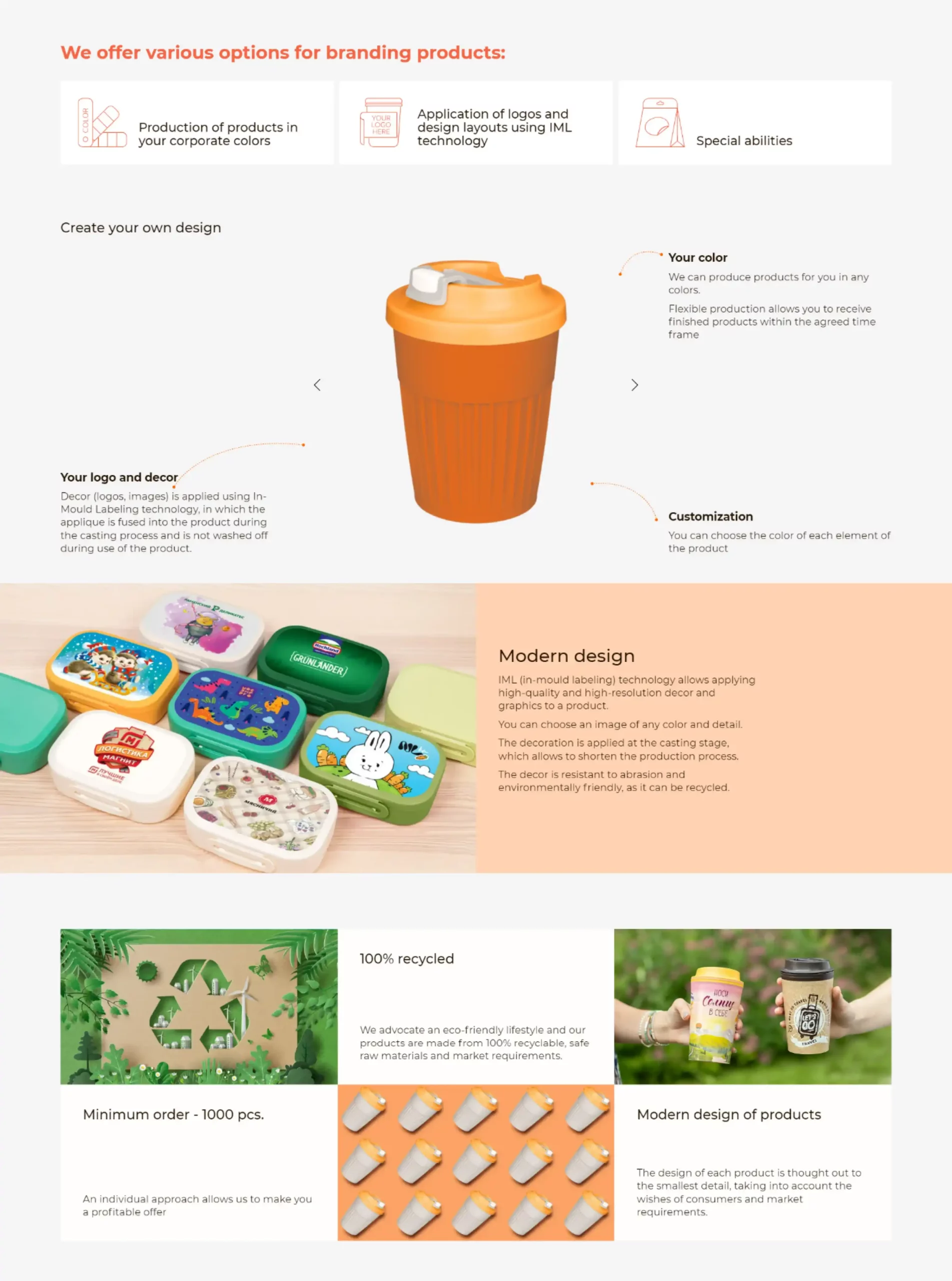
4. 3D Animation Implementation. A unique feature of the project was 3D animation, allowing users to rotate a virtual cup with a design that the company can provide. Interactive 3D animation demonstrates the possibilities of product customization and attracts users’ attention, making the interaction with the site more engaging and informative.
5. Bitrix 1C Integration. The site was developed on the Bitrix 1C platform, ensuring convenient content and functionality management. Integration with Bitrix 1C allows “Bytplast” to easily update the product catalog and manage the site without needing to contact developers. This solution also ensures high performance and site security.
As a result, the new “Bytplast” website became a modern and functional tool, contributing to improved user experience, increased customer loyalty, and strengthening the company’s market position. The development process included solving complex design, layout, and programming tasks on the 1C platform.


